[OPINION] I recently listened to an interview on 702 by Eusebius McKaiser with two of absa’s marketing executives. Actually, it was more of an interrogation, and they came out of the encounter battered and defensive, not doing justice to the brand they were supposed to represent.
The calls that came into the live broadcast were critical of the bank’s brand evolution and McKaiser certainly gave them a grilling; perhaps that’s why they came across as flustered and unprepared. The absa marketing executives should have been better prepared, as anyone in a service industry knows that criticism comes more easily than praise.
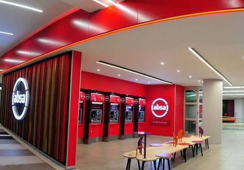
Personally, I think the new absa brand identity is a great improvement on what it replaced – it is modern and practical while the old identity was just that, old and tired.
And that’s a good reason for a brand identity evolution, as the need to keep a brand relevant by ensuring it represents current appreciation of design is vital.
There are many reasons for brands to evolve, one being changes in business ownership, which is relevant to absa. Others include changing market conditions; addressing reputational challenges, expanding brand portfolios or even new leadership asserting itself.
To varying degrees many of these apply to absa, but the main reason, I suspect, is internal: a need to motivate employees after all the uncertainty around Barclays ownership.
If the use of the lower case ‘absa’ aims to promote client-centricity, by reminding the bank’s employees that they are looking after other people’s money, then that is a good start. And if ‘Africanacity’ is an internal message to focus on the needs of the markets where the bank competes, that’s also a good thing.
I’ve heard some people describe the brand icon as representing a steering wheel – well, if that is representative of employees steering the bank into a new future, then that also works. Personally, I find it more representative as an ‘on’ button – that too makes sense.
There have been some quite astounding observations. One I heard was that that absa’s ‘steering wheel’ is a rip-off of Openserve’s broken circle – which I think is taking it a bit far. Another highly indignant caller accused the bank of wasting money, comparing the bank to SOE’s like Eskom – the caller needs to recognise that a SOE (or government department) uses taxpayers’ money, while a business is investing its own money and if it does so badly the market will punish it (ask Steinhoff!).
Back to that 702-interview. What was missing in the marketing executives’ defence of their brand was a formal expression of what the brand is trying to achieve: what they are promising their stakeholders, what the purpose vision and mission of the brand is, what values will live the brand, what greater good it stands for. And then how all this translates into the brand identity and other brand properties like visual language and slogans.
These are the basics of a good brand strategy and if they are not at hand when representing a brand then it becomes a shallow debate about aesthetic preferences, rather than what a brand is: a business tool helping a company deliver on its promise with purpose.

Johnny Johnson is a Brand and Communication Strategist at TowerStone Leadership Centre. He started his journey of becoming a brand and communications strategist as a Matie. Following twenty years in leadership positions at the advertising agencies: Ogilvy, Y&R, TBWA and Saatchi & Saatchi, Johnson ran his own specialist brand and communications strategy enterprise for 10 years.


